BrainCo
Scaling Design with a Tokenized System for Cross-Functional Teams

Role & Team
Timeframe
Company
Responsibility
Impact
40%
Faster Developer Handoff
34%
Faster Designer Prototyping
3 products
UI Consistency Achieved
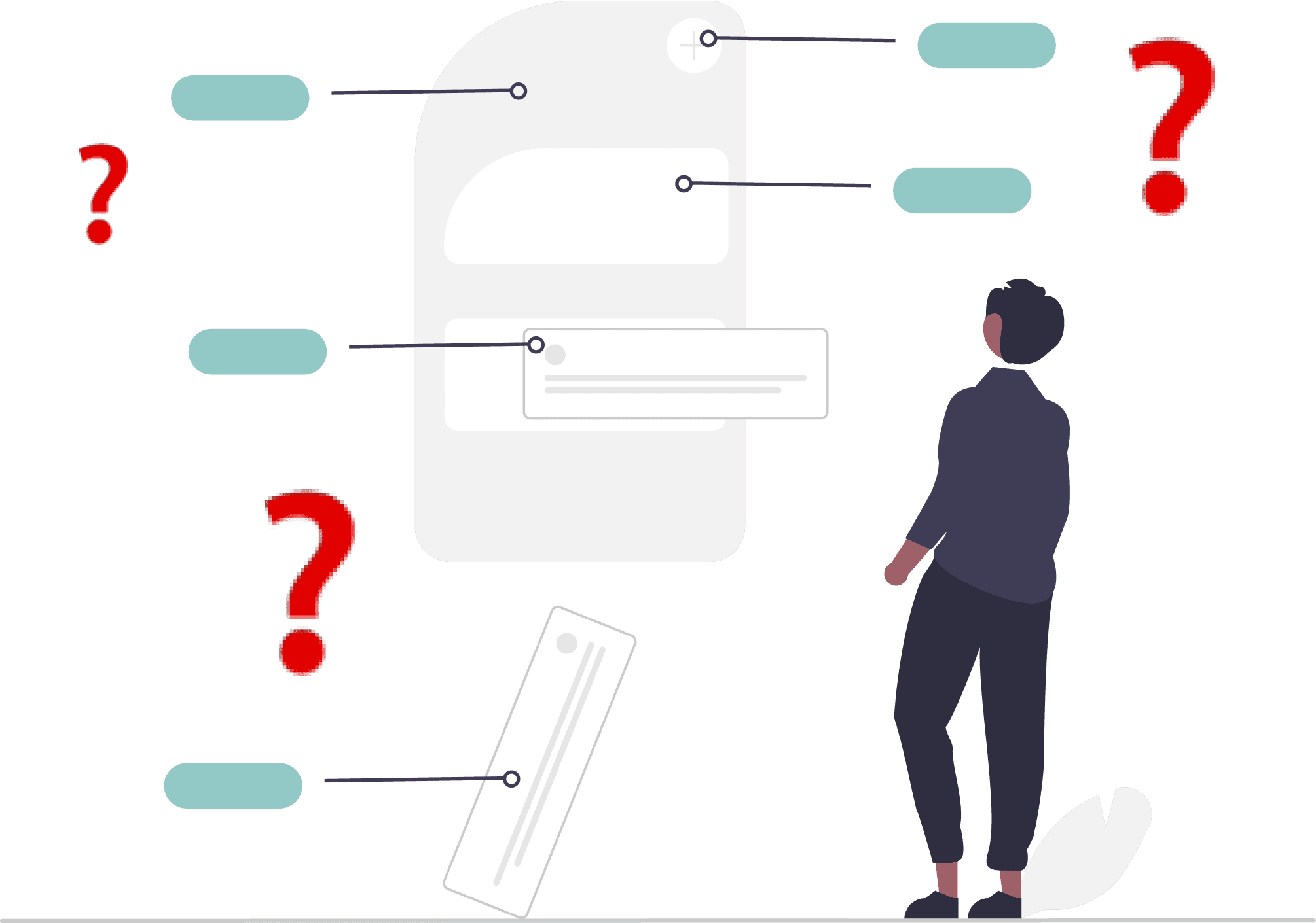
Problem Statement
Fragmented Design & Development Process
BrainCo is a neurotechnology startup. Over the decade that it has been founded, it has branched to 13+ digital SaaS products.
As the company continues to scale, developers and designers have become extremely frustrated with the design and development process: The lack of UI consistency within and across products has cause development inefficiency and design redundancy.
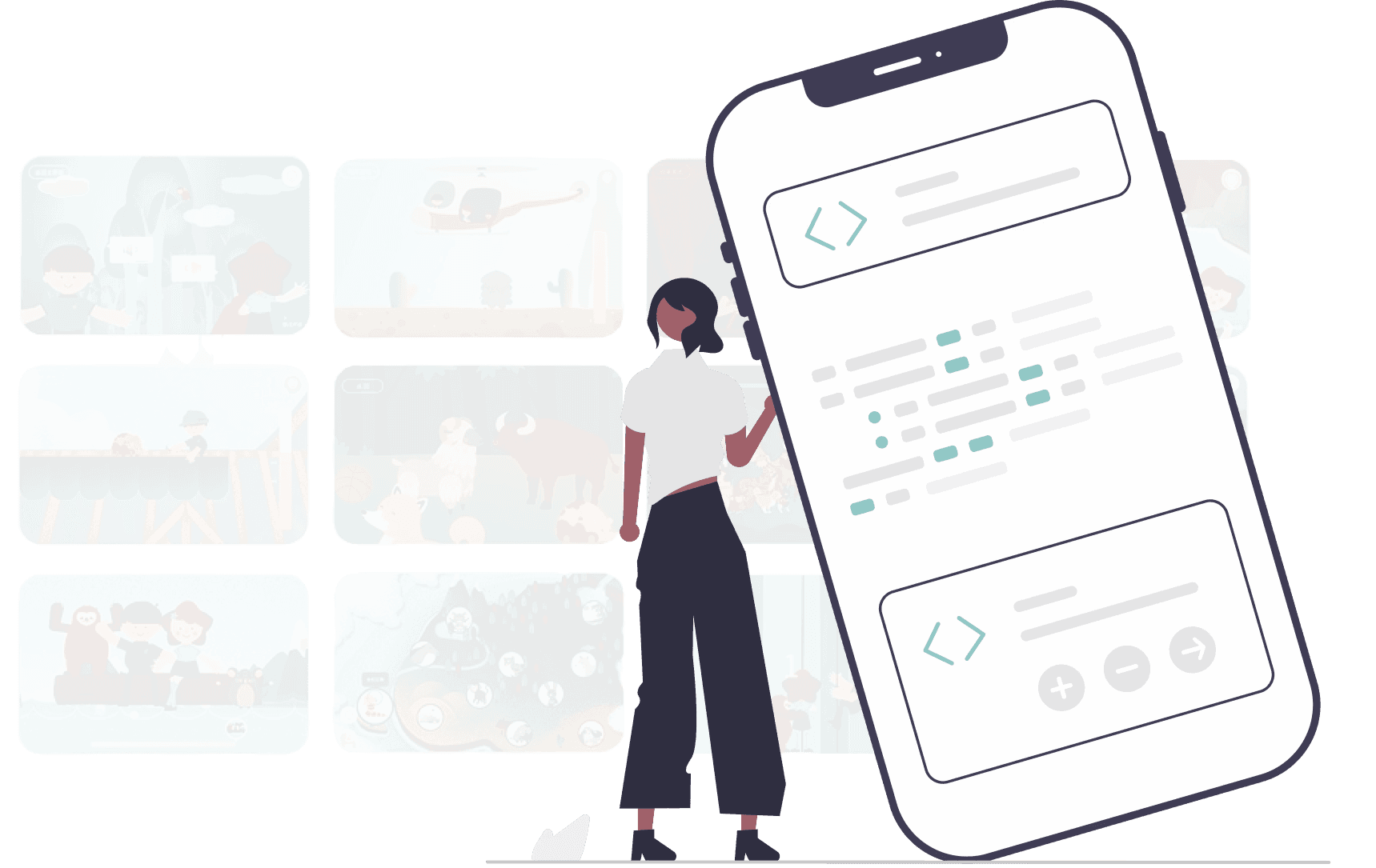
Solution
A Tokenized Design System
I designed and implemented a design system tokenized and codified to the engineering level for 3 products. This is the first ever design system at BrainCo.
My work includes:
UI auditing for 3 products
Design system benchmarking
Component prototyping, documentation, and developer handoff
Quality assurance
Strategy roadmap
Design system workshops
Building the First Design System at the Fast-Growing Startup
Context
One Product Suite, Two Themes, and a Growing Mess
When I joined the StarKids team, the product suite was already well-established—with separate B2B and B2C apps serving different users and built by different teams. But as the company grew, so did the complexity.
The key difference? Visual styling. The B2C app had a vibrant, playful theme. The B2B app was more data-heavy and professional. But as the company expanded and teams needed to integrate data and features across both apps, things got messy.
For developers, that meant diving into a major code refactor. For designers, it was a rare opportunity to zoom out and ask: Are our systems built to scale?
One problem quickly rose to the surface: our shared components weren’t scaling at all.
Problem
Shared components don't scale without a system

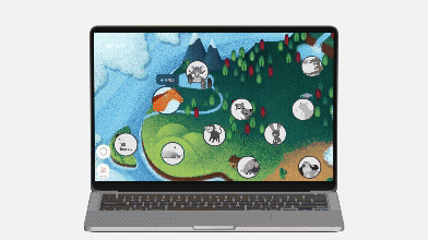
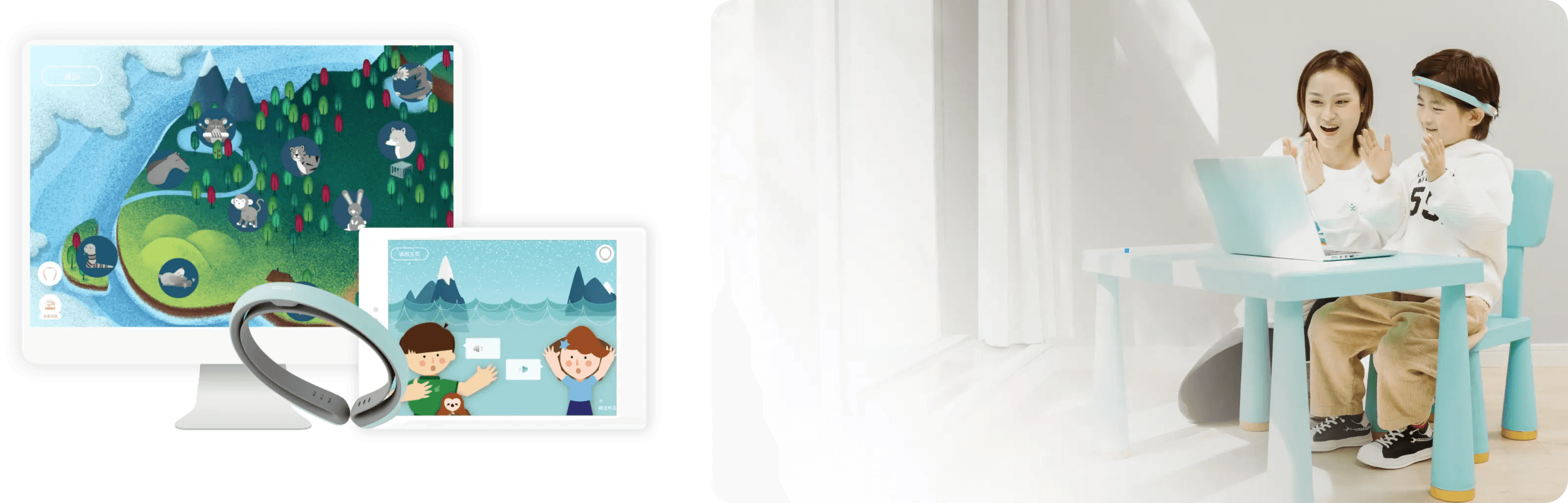
B2B (for institution use)
Available on iPad, Android, and Desktop

B2C (for family use)
Available on iPad, iPhone, and Android
At first glance, reusing components across the two apps seemed efficient. But under the surface, it became clear that without a design system or token-based styling, duplicating components between products was more painful than productive: Designers had to manually tweak styles to match themes. Developers had to recreate logic with slight variations. And over time, inconsistencies piled up.
To understand the scope, I conducted a UI audit across the B2B and B2C apps. I found that most components looked nearly identical—except for color—but were implemented differently. This lack of standardization slowed down collaboration and introduced design & development debt
Mapping the Gaps
How We Worked Was Slowing Us Down
To get to the root of the problem, I interviewed designers and developers and mapped their experiences across the product lifecycle—from early design through QA and iteration.

This journey map revealed a repeating pattern:
In the design phase, too much freedom led to misalignment.
During development, inconsistent styles made component reuse difficult.
In QA, missing guidelines made it hard to judge accuracy.
And in iterations, confusion around usage led to more errors and rework.
Without shared standards, each stage added friction and multiplied the cost of even minor changes.
Key insight: The problem with shared components was only a symptom of something bigger:
Inconsistent components
Redundant styling logic
Unclear communication across teams
Lack of scalable infrastructure for design and development
This inefficiency highlighted an urgent need—not just for fixes, but for a foundational system that could support consistency, reusability, and scale.
How might we create a design system that is clear and easily applicable for both designers and developers?
Building the Design System
Well-Documented Design Library
Based on benchmarking with other design systems, I determined that:
Our design system should include component prototypes, default + variants, and spec, etc.
Our components should be reusable, customizable, considerate of edge cases, and accessible.
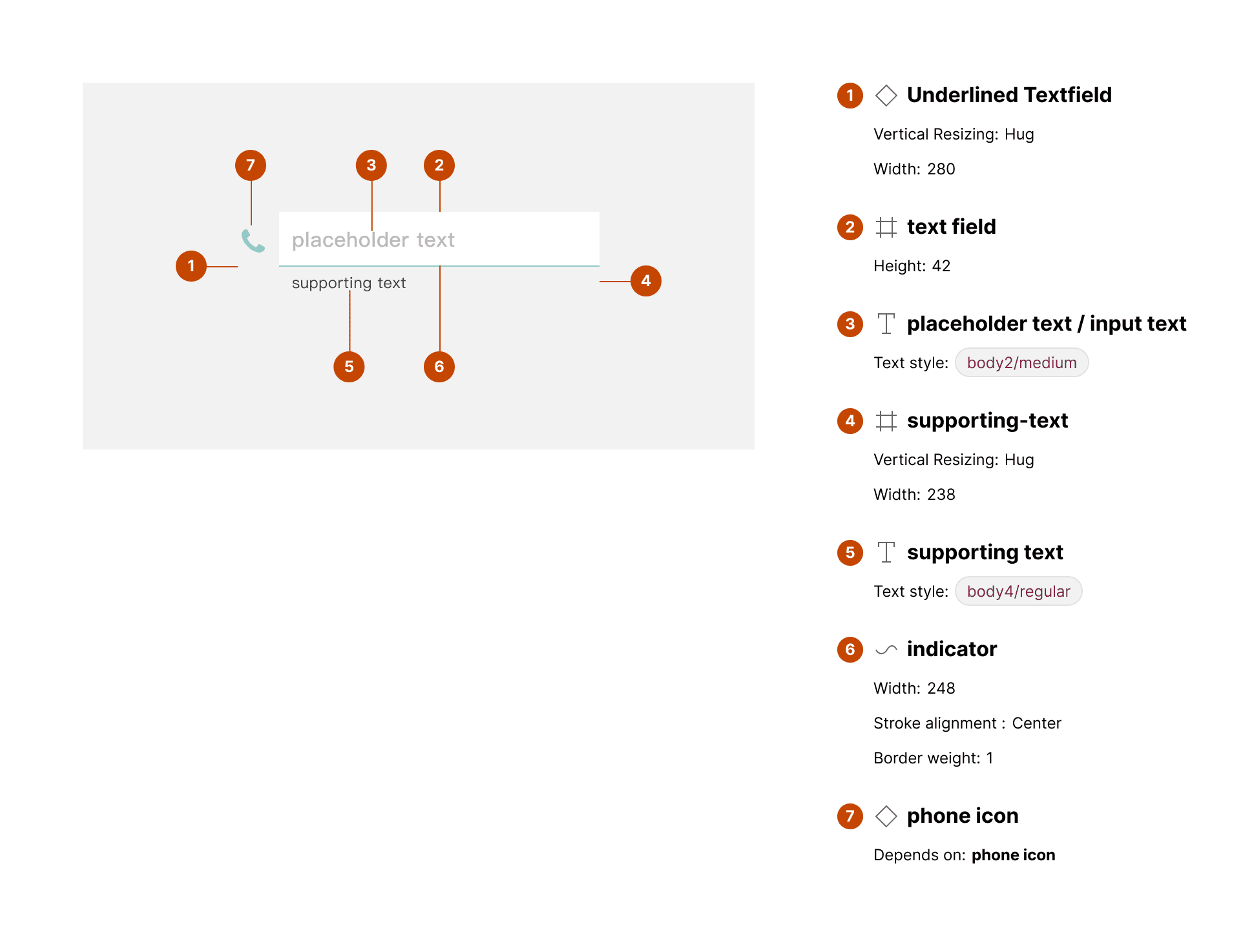
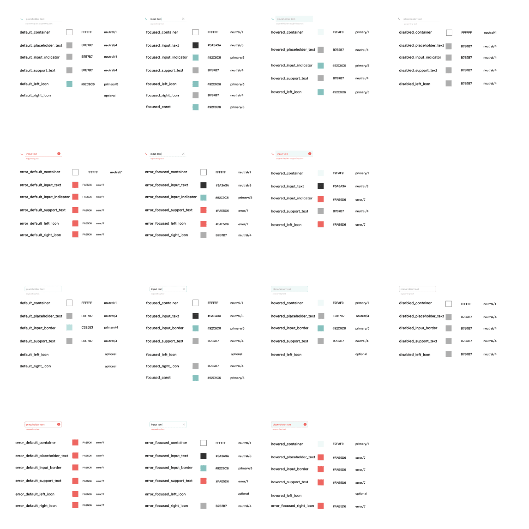
👇 Following these guidelines, below is an example of my documentation for the component "Input Field":

I automated the workflow using a variety of tools.
For example, I used EightShape Specs to quickly generate anatomy and layout specs. The documentation of the specs has proved helpful as our developers did not have access to the Figma Dev Mode.
Always be Aligning
Collaboration with the Stakeholders & Users
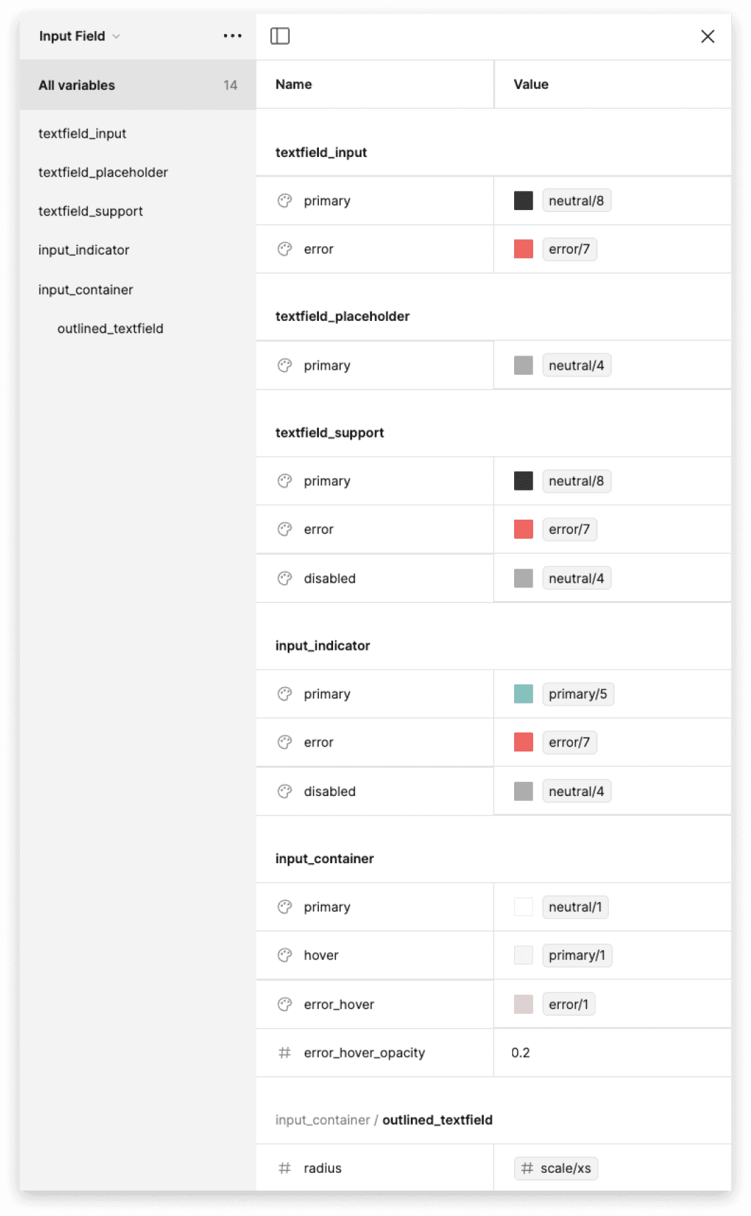
Through conversations with the developers and designers, we have come to conclude that we use "component_status_element" as a format for naming the design tokens.
I used Token Studio to retrieve the json file for developer handoff.
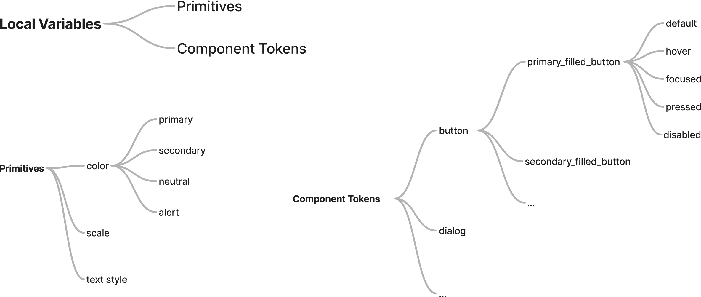
(E.g., primary_filled_button_default_text)
Refining the Design System & Design Delivery for Scalability
I successfully built and implemented the design system for 2 existing products. This successfully boosted design and development efficiency, enhanced design consistency, and promoted communication.
Design team
Improved the perceived efficiency and eliminated the need to recreate components.
Development team
Reduced the maintenance costs by up to 6 times.
Communication
Improved the sync between designers and developers and inspired internal collaboration.
Optimizing the Workflow
Successful integration of Design Delivery and Product Management
As I was building the design system, I collaborated with developers and streamlined the design delivery process. I proposed a workflow and specified the responsibilities for designers and developers in terms of defining the specifications and tokens, making sure that the process can go smoothly. The process has been adopted and has shown success.

Because the design system is an internal tool that doesn't involve our PM, we have to manage our progress on our own. Due to limitations on budget, we were not able to use task management tools such as Jira. I thus created a master doc to document the design and development progress, with QA feedbacks.
Optimizing the Design Tokens for Developers
Reducing the maintenance costs by up to 6 times
During the iterations, I also found that the existing token setup can add to unnecessary complexities and optimized the design tokens accordingly.
Before:
82 tokens
component_status_element
E.g., "outlined_textfield_hover_container"
After:
14 tokens
element/status
E.g., "input_indicator/primary"
Optimizing the Design Tokens for Designers
Allowing for Easy Scanning when Selecting Colors
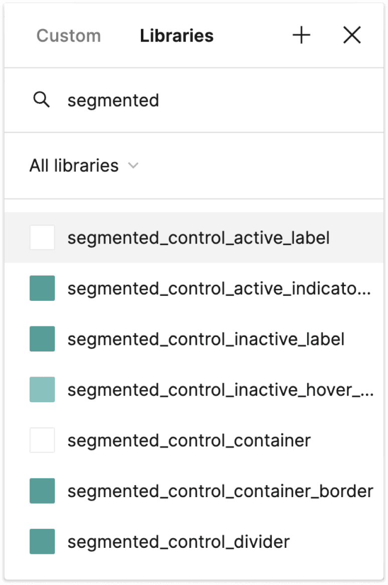
During the iterations, I also found that the existing token setup can add to unnecessary complexities and optimized the design tokens accordingly.
Before
Hard to scan and use
component_status_element
E.g., "segmented_control_active_label"
After
Easy to scan and use
component/status_element
E.g., "segmented_control/active_label"
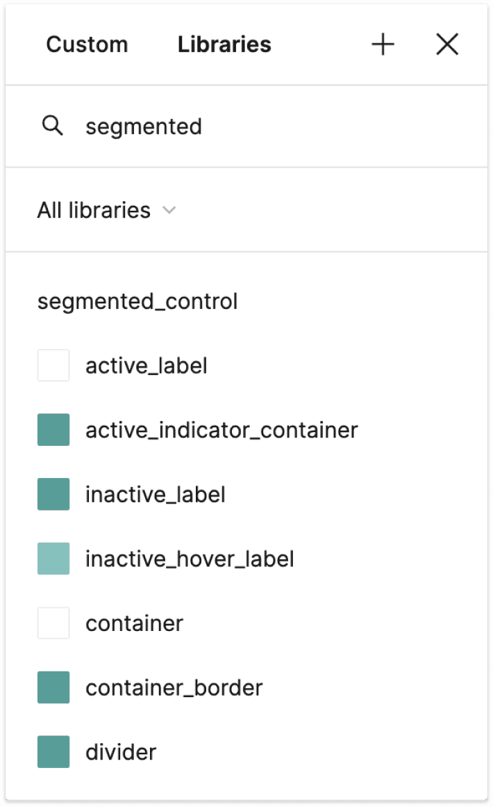
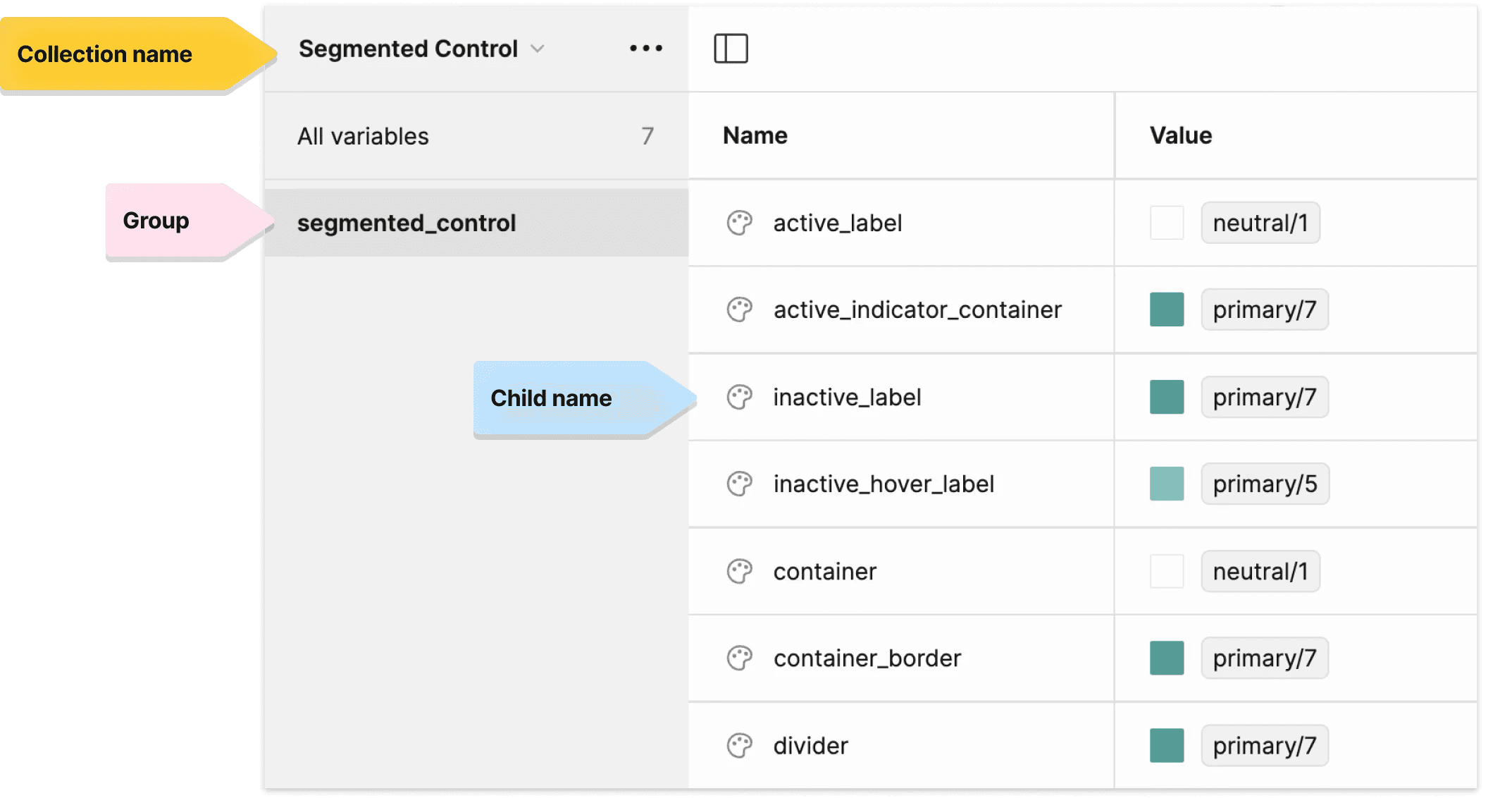

Note: After confirming with the developers, I learned that this change didn't add to extra workload for our developers, and they were happy to make the change in the code.
Ensuring the Scalable Growth of the Design System
Evaluating the Team Needs
Collaboration with the Stakeholders & Users
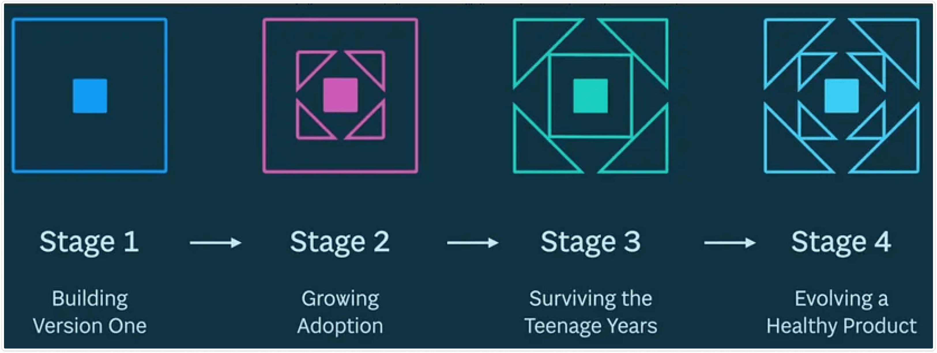
Photo credit to Brad Frost
I studied design system maturity frameworks (Brad Frost, et al.) and interviewed 2 designers + 1 developer about their 3-year vision.
Key insights:
Need to boost adoption and treat the system like a living product
Team satisfied with new delivery process, wants deeper collaboration
Demand for both product-specific systems and a global system
System seen as necessary but never prioritized by leadership
Roadmap Planning for the Future
Mapping the Strategies for Sustainable Growth
From the research, I drafted a comprehensive roadmap covering 6 key areas to work on. I presented this roadmap during the middle of my internship. During the remainder of my internship, I touched upon all the tickets in the "Now," "Next," and "Future" stages.
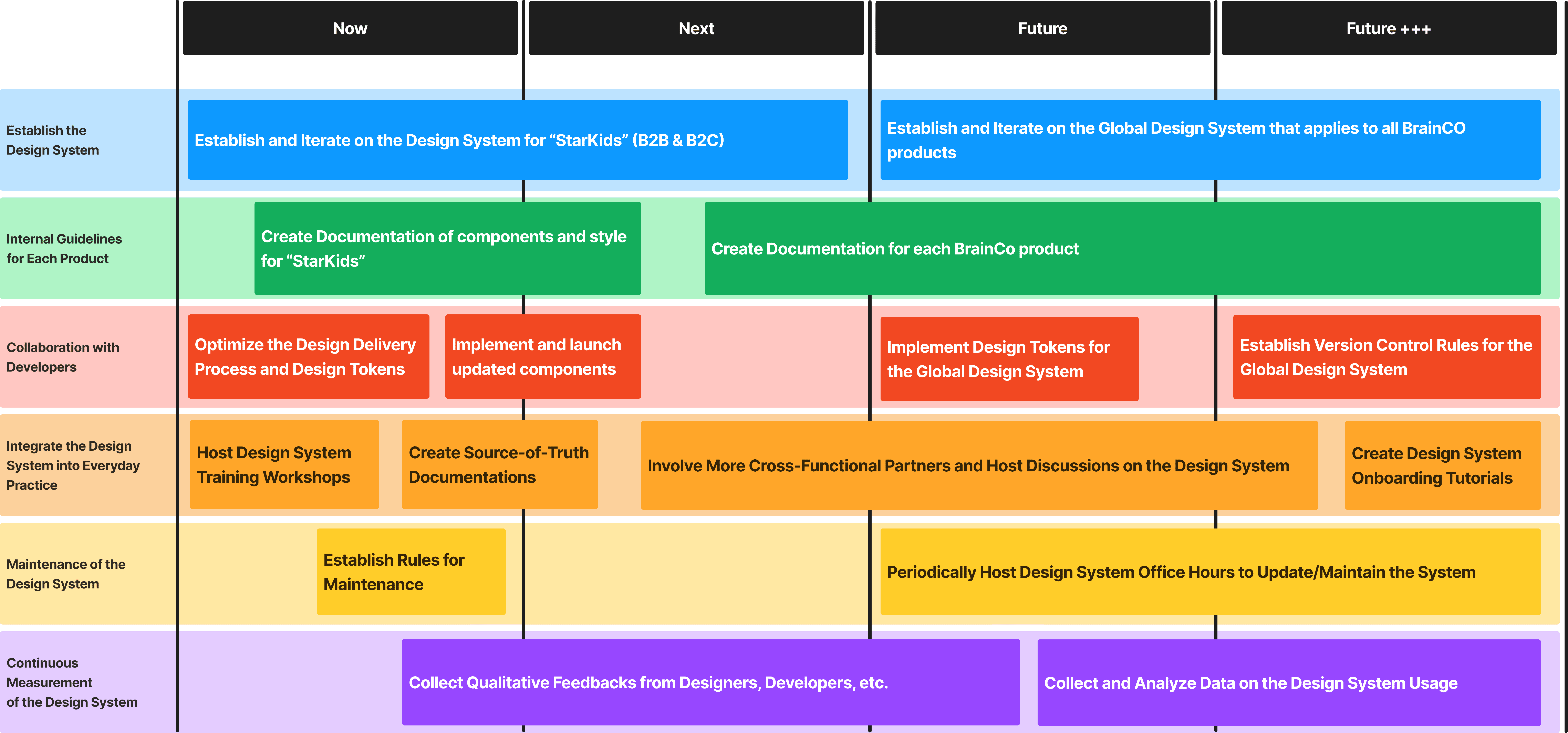
For maintaining the existing design system, I adopted a design system governance process template from Brad Frost and revised it based on our team needs accordingly.
Stakeholder Communication
Boosting Design Maturity for the Team
I conducted workshops with the team of 12 designers (4 UX/UI designers and the rest working on branding, motion, packaging design, etc.) and our dedicated developer to call for collaboration on the design system.
Because most of our design team are not UX/UI designers, and have not been exposed to the idea of design systems yet, I did a flash course on the design system and atomic design before going into the topic. Then I invited them all to discuss how we might collaborate together to use and contribute to the design system
Success
Gaining VP Buy-In for Building a Global Design System
I successfully helped the team develop a deeper understanding of design systems. I received positive feedbacks from the team, and my work sparked discussion on how we could work together on the design system.
My contribution also directly led the team to start the initiative of establishing a global design system.

Zhaoyi Yang
VP & Design Lead, BrainCo
"Ariana has made a remarkable impact on our team as a UX Designer. During her three-month internship at BrainCo, she played a key role in organizing the design tokens and demonstrated an impressive understanding of building design systems. Her data analysis skills and excellent presentation abilities truly set her apart.
She collaborated effectively with various designers and developers, fostering a positive working environment. At the end of her internship, she provided a thorough summary of her methods and insights during the design team review, which was both insightful and well-received."
Retrospectives
Next Steps
Building off from this work, I proposed to establish a global design system across all BrainCo products. This proposal was adopted by the leadership. During the remainder of my internship, I led this effort and collaborated with three other designers, organizing our current design assets and components across 7+ products.
As I returned to BrainCo in 2025, I got the proposed roadmap implemented, and I made sure each critical step in maintaining and scaling the design system has well-defined ownership and accountability.
Learnings
This experience deepened my technical understanding of design systems and developer collaboration. But it also revealed my passion for optimizing team processes: building systems that empower teams to work efficiently and deliver meaningful user experiences.
I learned that the hardest part of design systems isn't the components; it's adoption. Success requires stakeholder buy-in, education, and treating the system like a product with users (designers and developers).
If you would like to learn more, please contact Ariana for more information.
arianazhu.design@gmail.com
Copied
Check out more of my projects:


Get in touch with me at
arianazhu.design@gmail.com
Copied
Designed and built by Ariana Zhu © 2025